










Misery – Stephen King
MISERY…. I am not the first to do a nice edition of the only works of Mr. King to go on to win an Academy Award and I surely will not be the last. Misery was on my radar but not right away. I changed gears, when in October of 2024 when I met a lovely young and relatively new artist dabbling in the Stephen King world at the 1st KingCon held in Las Vegas Nevada. Kristen Bird was the name, and artwork is 100% her game. She had done only a few things but had a booth at our convention and I was so enamoured by her artwork that I asked her if she would do a book for me. I even let her choose and as Indy was told at the end of The Last Crusade… “You have chosen wisely” I said. She was very happy and that alone made my decision worth it BUT when I saw what she turned in? It solidified it. Misery was born. And it will be the fastest Indy Editions book from start to delivery. Let’s jump into it and learn a little bit about the package you are about to open.
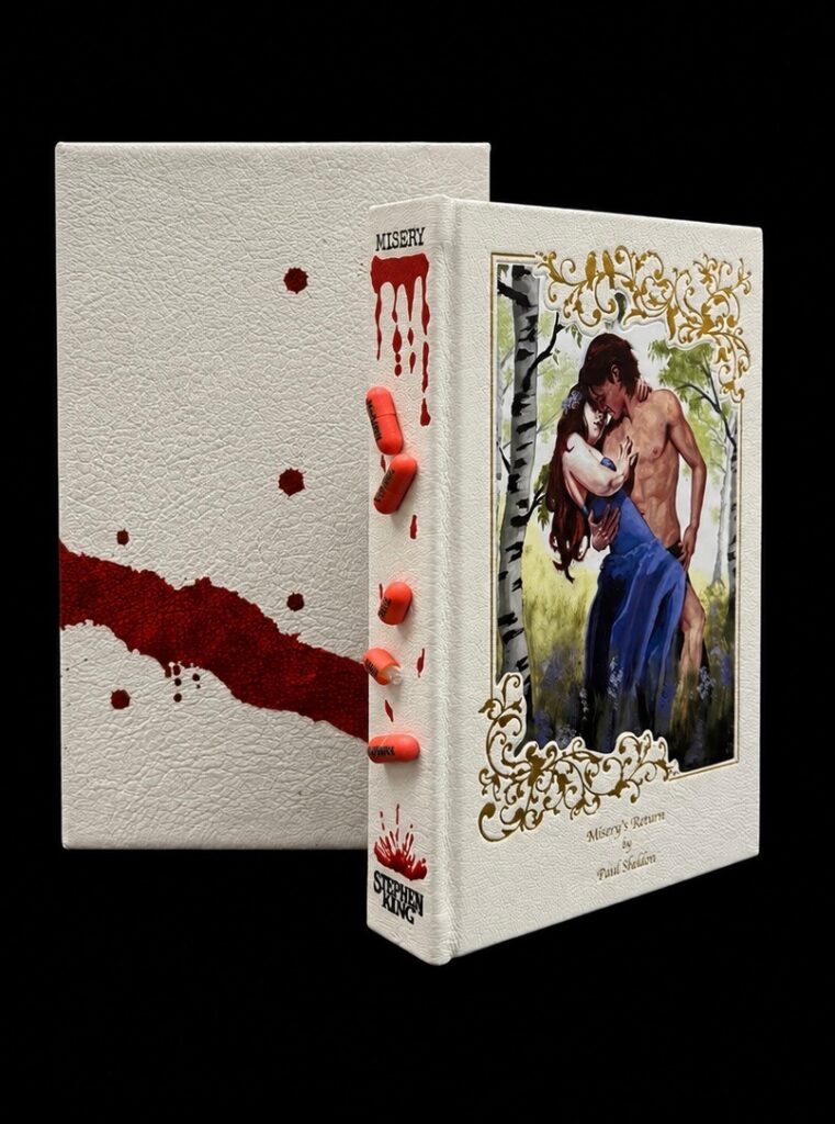
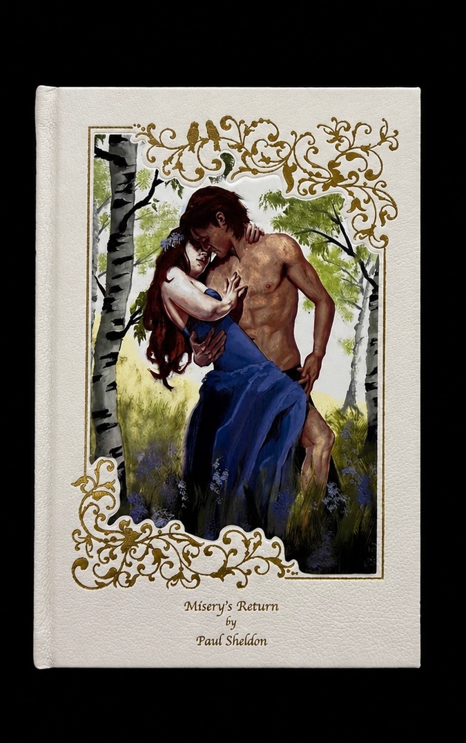
The design for Misery takes inspiration from the 1987 paperback edition which had a double cover. Why may you ask? I always loved that paperback. I had a copy and I always found it funny/odd that such a dark story would have King’s face on this hunky man holding that girl in a loving pose. It always stuck out to me and of course it was the medium I used when I first read that book back in the early nineties. We all know that Misery has been given proper justice too and the typewriter was a focal point of that edition. This just made sense. For me, that cover, the pills that became his escape and the wheelchair that was his prison were all standouts for this book. I had to find a proper way to incorporate them all. And I feel I did.
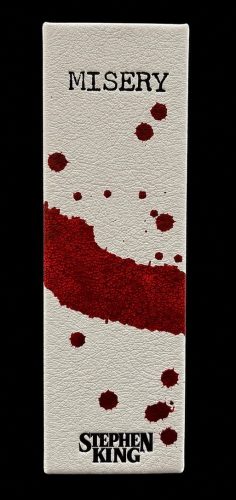
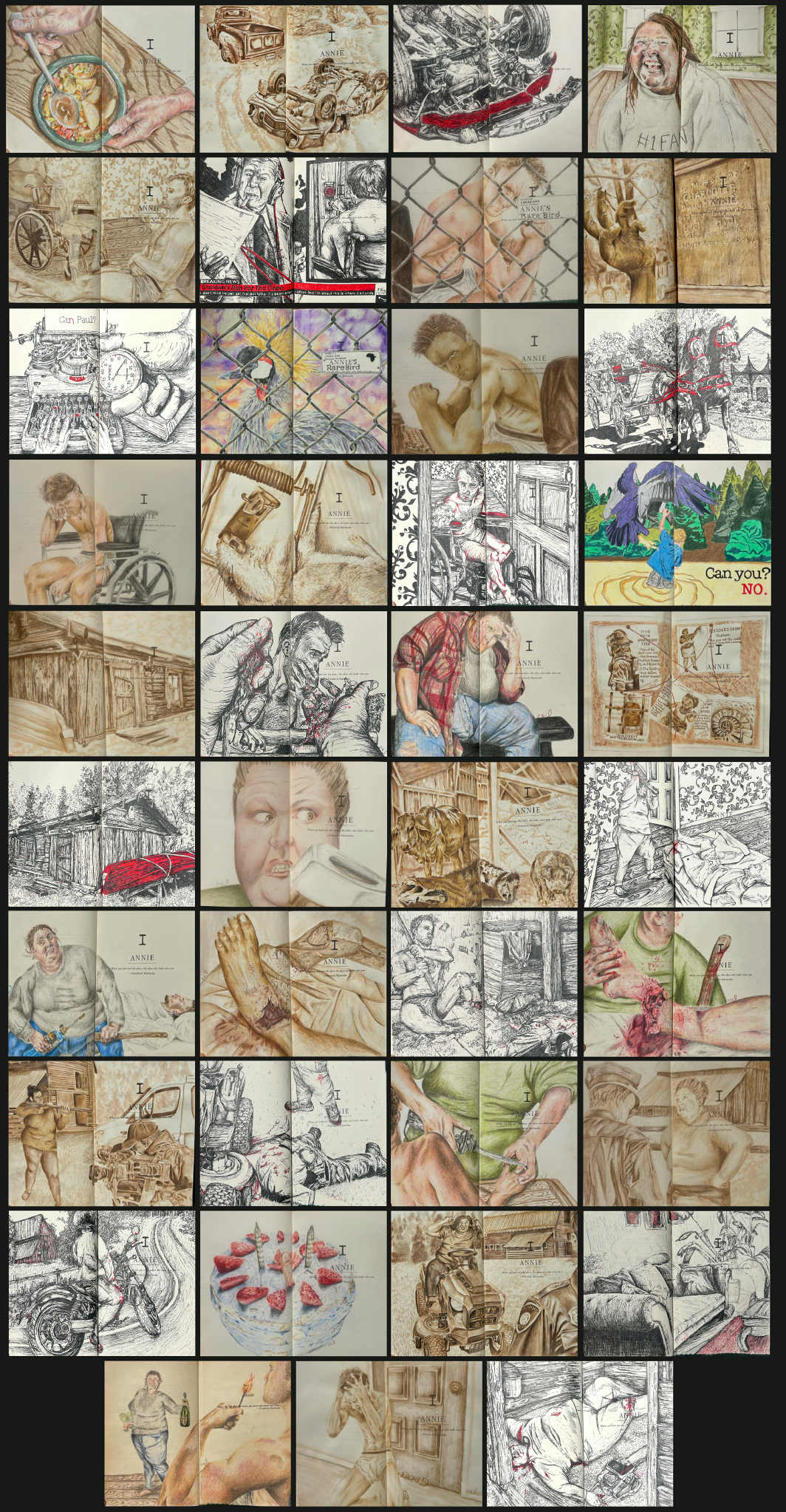
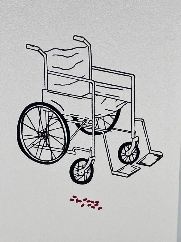
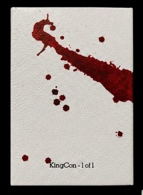
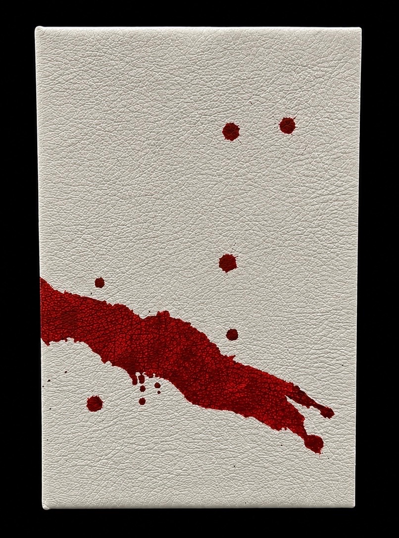
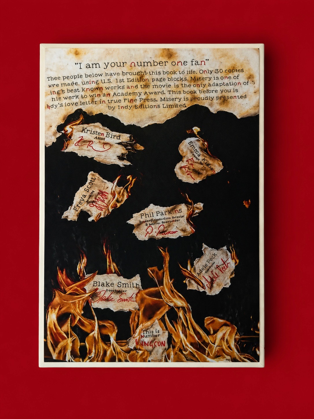
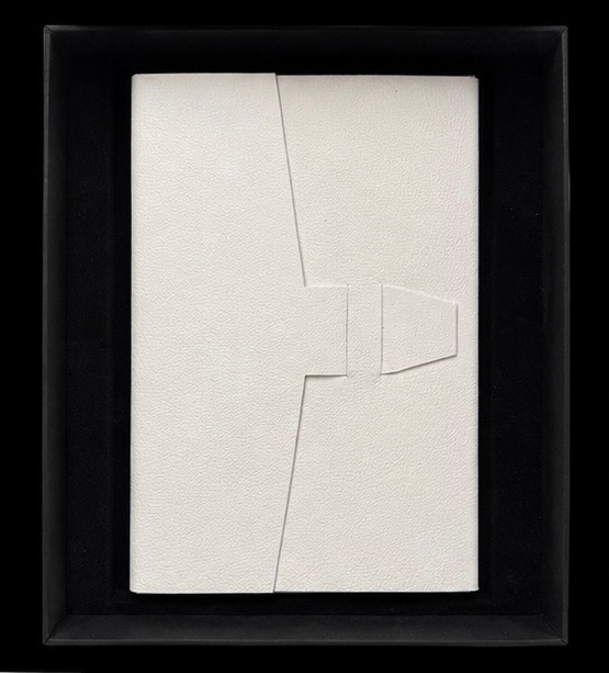
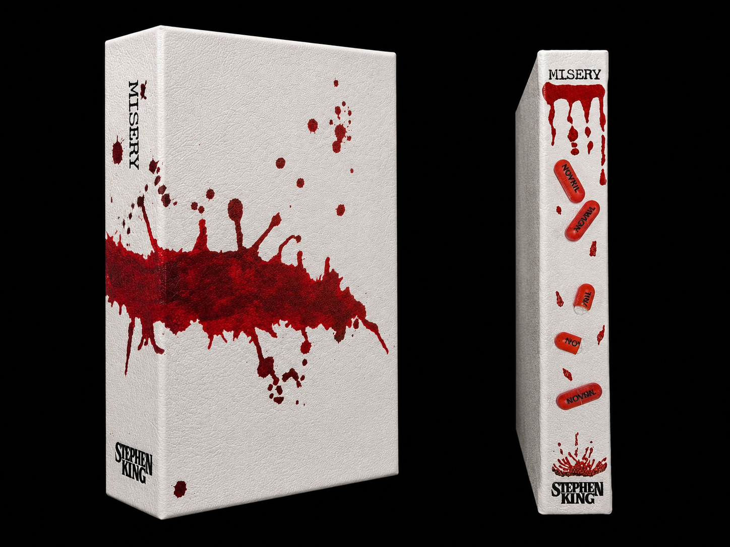
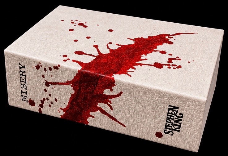
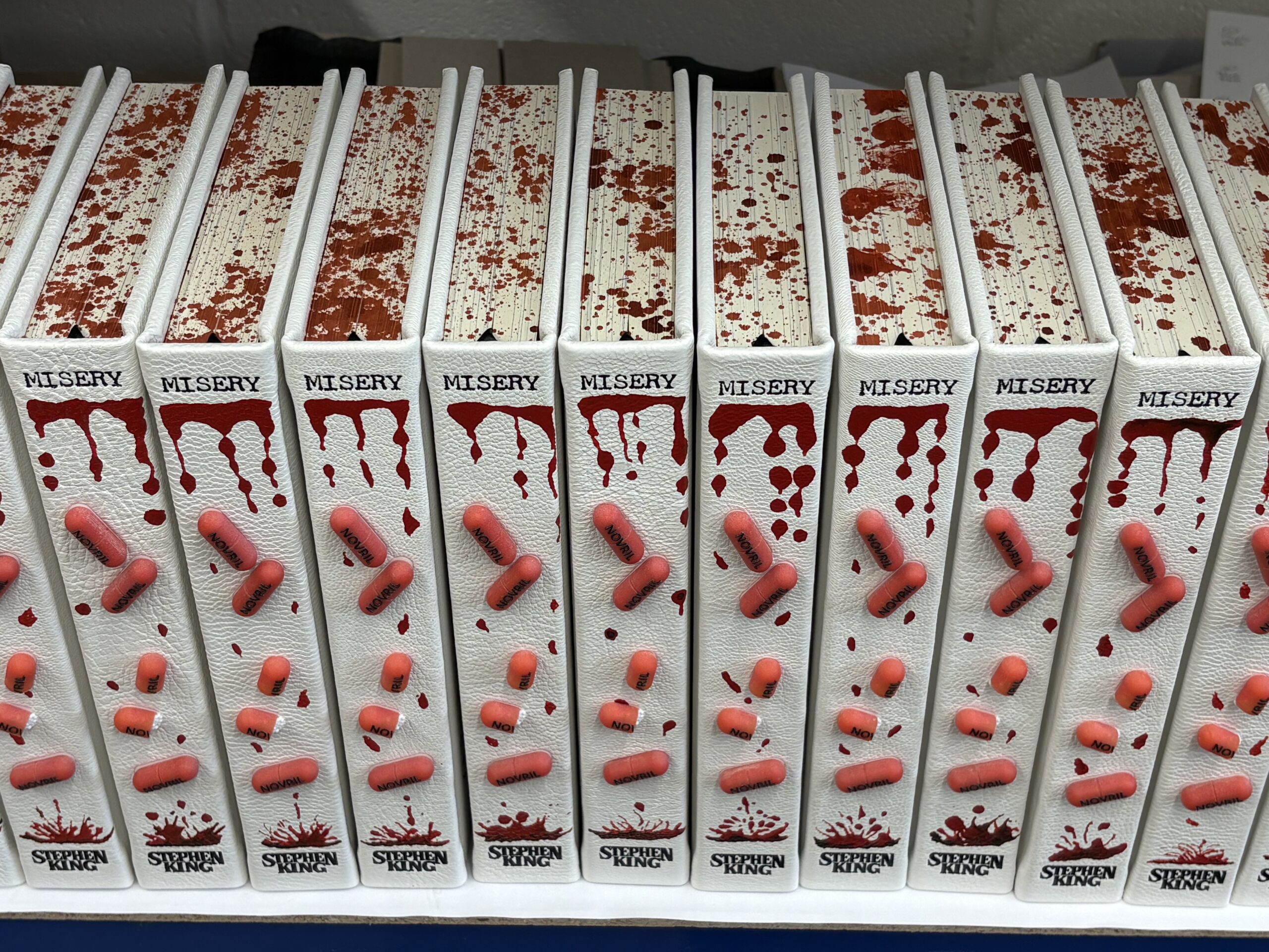
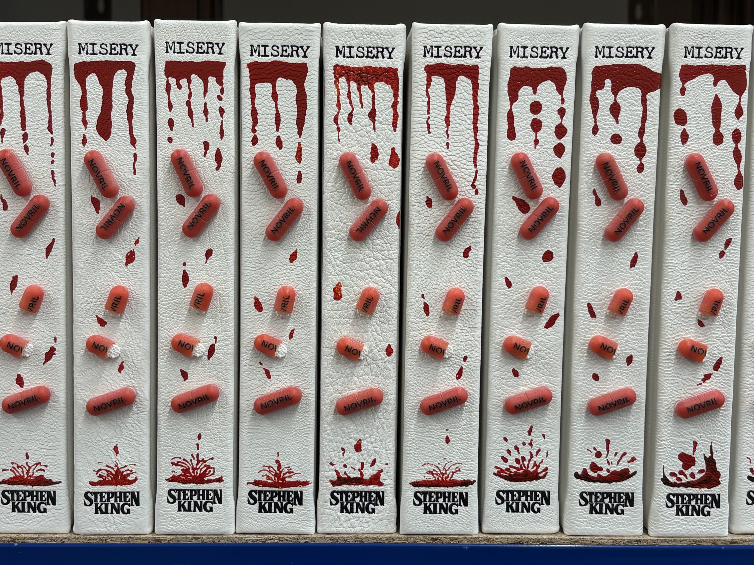
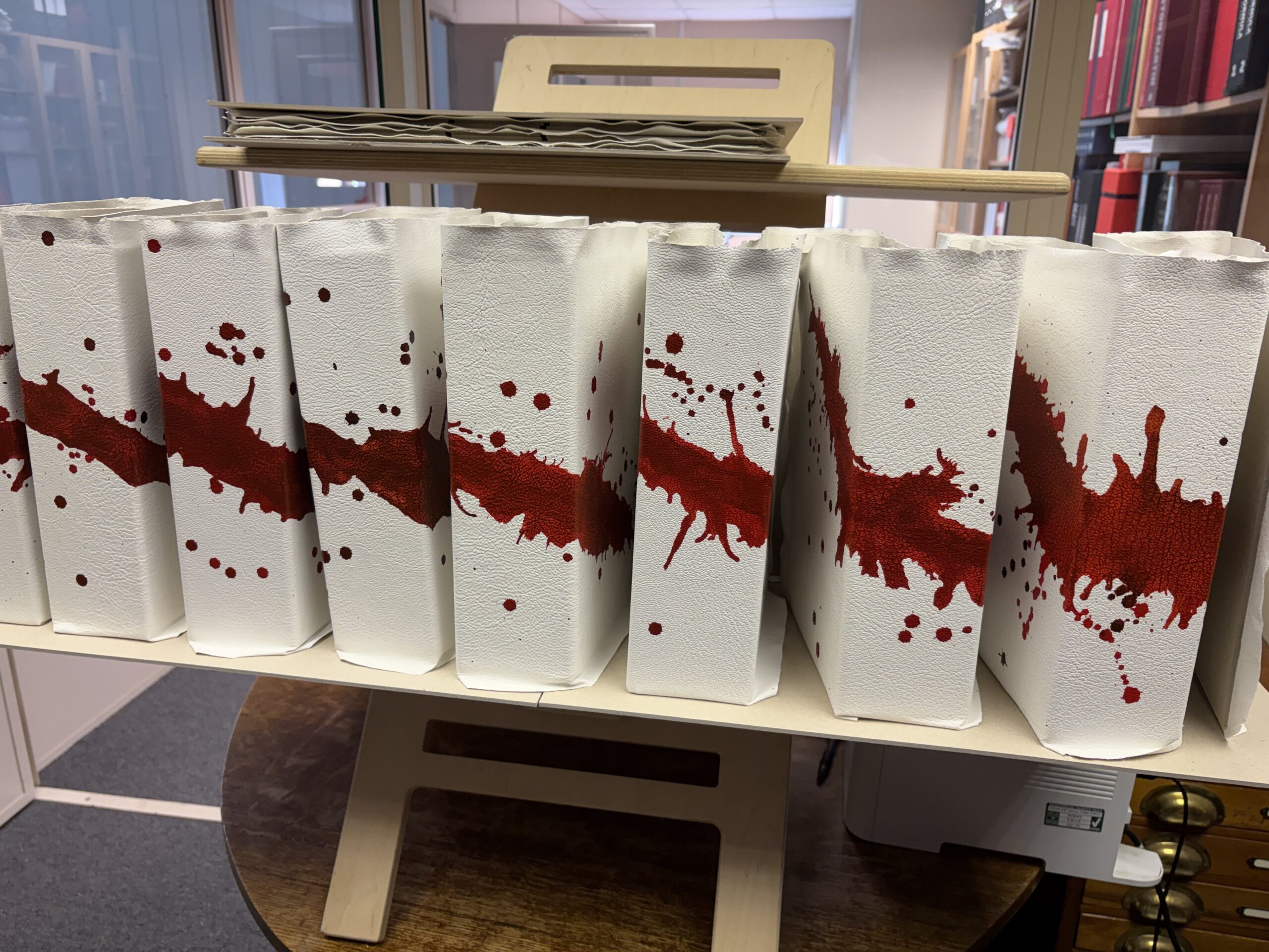
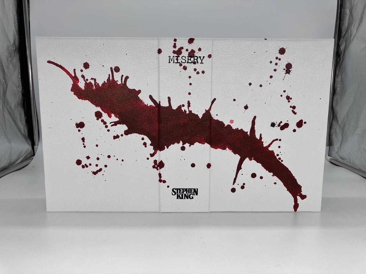
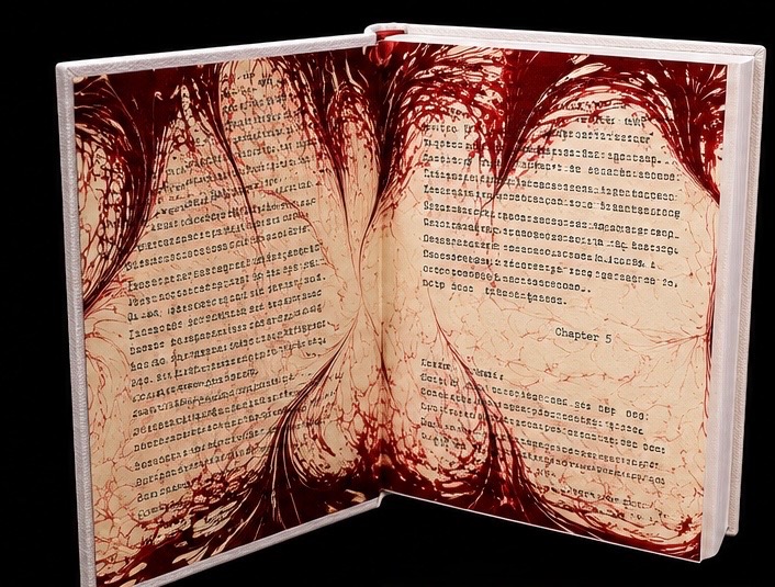
Misery’s Return becomes the focus for the front design, with original artwork by UK artist Harriet Bone, but with a twist. Turn the book over, the right way round, and you have the stark wheelchair to which Paul Sheldon becomes confined, along with a collection of Novril pills blocked in red foil, scattered on the floor. The book is bound in white goatskin leather to maximise the colour contrasts. 3D printed versions of Novril pills are on the spine ‘formed’ from the spilling of blood. The blood motif appears on the three edges of the book, and is strikingly mirrored on the endpapers, marbled by Freya Scott, where the inks drip and swirl over passages of text taken from the book with the missing typewriter characters faithfully reproduced. I thought this was fitting to give some homage to my friend Paul Suntup and his vision that was his first major publication in 2017. The Solander Box, also in white goatskin, is bold with its splash of red. Sitting beneath the book you will find a leather portfolio of images from the book by the young illustrator Miss. Bird. As always with these books, beautifully done original works of art (remarques) are drawn into each of the books by Kristen. No two are the same and different mediums were used throughout the 30 copies.
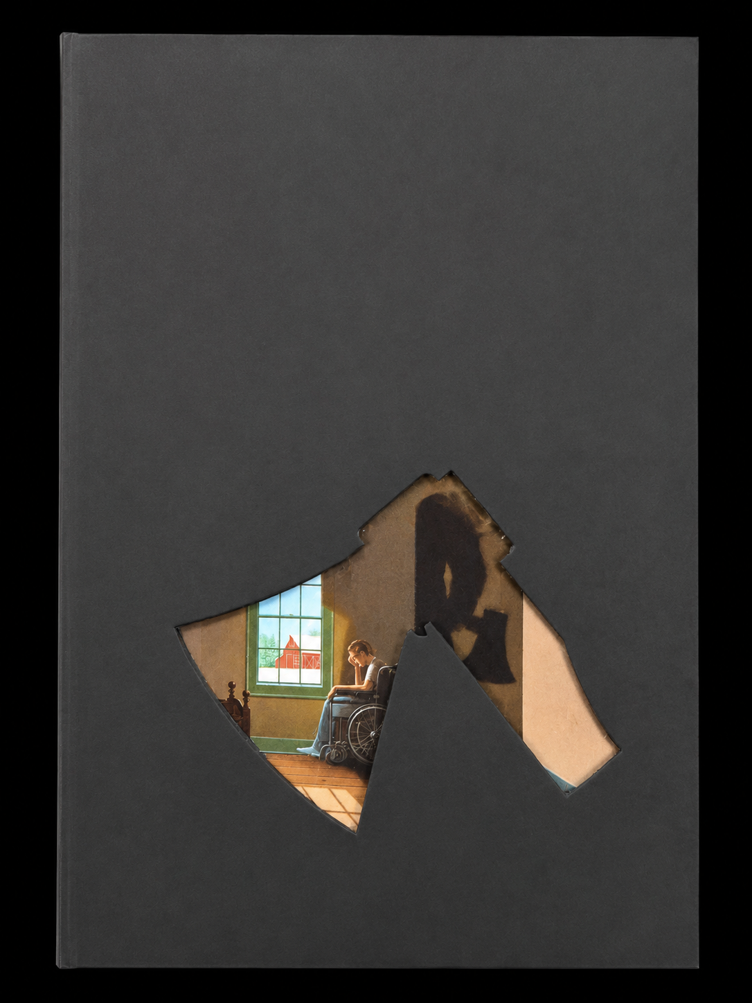
On the left-hand side of the box, with an axe head cut out, you glimpse the original dust jacket from this First Edition. The axe needed to find a small place in this rendition of Misery, and I felt this subtle yet powerful embrace of the item that confines Paul Sheldon was the right call. It fits just nicely and I felt that all major aspects of the book were included. By no means do I mean to replace anyone’s edition that has come before me but rather grow upon them. I feel that is what has been done here with my take on this book:)
Please enjoy………… MISERY (‘S RETURN)
Misery

Artist Remarques